 |
Our website looks a bit different all around since last week 🙂
- We have upgraded the underlying Bootstrap (which serves as the base for our look) from version 3 (rather ancient at this point) to the latest 5.3.
-
We took this opportunity to make some small improvements:
- dark-themed navigational bar,
-
navigational bar properly collapsing on mobile (or just narrow window sizes),
-
search box in the navigation bar,
-
simpler “Donate” button leading to streamlined Donate page,
-
from the main page we have a link “Video Tutorial” to our presentation from Dev Days of Summer 2024.
-
In some cases (like link colors and font), we decided to follow the new Bootstrap defaults.
This is a preparation for a bigger website redesign. What we have now, thanks to using the latest Bootstrap 5.3 and thanks to being simple (generally following Bootstrap conventions, with only minor customizations) should lend itself nicely to bigger redesign.
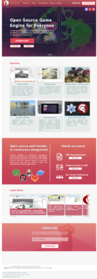
What bigger redesign, you ask? 🙂 Well, we’ve been planning a website redesign for some time now, to make it both more impressive and communicate our intentions better. Attaching to this post a cool main page redesign from Adrianna Matejek. This is something which we want to eventually reach!