|

|

|
We’ve made a lot of editor improvements lately, including features, fixes and UX improvements. This post goes with big “thank you!” to everyone testing and providing feedback! I am seriously proud of how the engine became much more user-friendly and approachable in the recent months. A number of big changes (big in their impact, but often quite easy to implement) made wonders. UI for many things became straightforward, both for new and advanced users.
And I know it’s not the end — I have a lot of valuable feedback prioritized, and one more big UX thing (this time only for Windows users) will arrive this weekend 🙂
Enough bragging. New things I want to announce today:
-
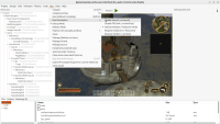
“Run -> Run Parameters” menu, with options to disable sound, FPS limit, request window or fullscreen for the next application run. These menu options simply cause appropriate command-line parameters to be passed to the application. We supported these options since ~forever, now they are easy to actually use when working in CGE editor.
-
Dragging and dropping in the hierarchy of
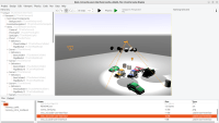
TCastleTransformwill preserve their world transformation. For example, if you have a box X with translation, that is a child of transformation Y with some rotation, and you change the parent of X to Z — we will make the world transformation of X stay the same, so it will visually stay at the same place. Internally, the box X translation/rotation will be adjusted to the new parent Z.This is similar to how drag and drop in hierarchy of
TCastleUserInterfacealready behaved, so these things (dragging UI and draggingTCastleTransformin hierarchy) are now more consistent.Moreover, you can now hold “Ctrl” when dropping to not preserve the world transformation when changing parent. And it affects both dragging UI and
TCastleTransform.Limitation: We preserve the world transformation only when scale (of the source and destination object, in world space) is identity. Otherwise, our current math cannot preserve the transformation correctly in all cases, so we outright cancel the “preservation” feature when we detect any scaling.
-
Warnings and error lines are now properly colored in the output.
-
Drag and drop in the hierarchy is more natural when you want to insert an item as a child of something. Previously it required to drop it over the right side of the item, which was unintuitive (it was non-standard UX and we didn’t inform you about this feature anywhere). Now by dropping over the middle of the row, we understand you want to “drop inside” (insert as child).
-
We now show in UI a button to invoke context help (for the current class or property). I suspect that most advanced users already know to invoke it using F1. But new users were not aware of this super-useful feature — hopefully much more prominent now.
-
If you try to remove a component that cannot be removed (e.g. root of the design) we now provide a helpful explanation why it cannot be removed, instead of silently ignoring the command.
-
New light icons for our tools (translate, rotate, scale etc.) by Adrianna Matejek! Thank you!
-
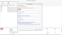
Various improvements to “New Unit” dialog, now you just input “base name” and in simple cases let everything else be as default. The dialog also features now new unit with behavior and a better template for view.
-
The “Design” menu now clearly recommends the “New View” as the most often action you want to start there.
-
The list of views is now sorted by name (and can be sorted by other columns) once you open the project.
-
You can close the design with Ctrl+W. The current UI deliberately encourages to browse the views within the project, so exploring them (opening and closing) is natural.
-
Focus after undo (Ctrl+Z) allows to make next Ctrl+Z immediately. You can undo multiple steps now more reliably.
-
I added shadows to the default “3D FPS game” template design.